This article is a preview from the Spring 2020 edition of New Humanist
The diminutive House of Illustration is modestly tucked away amidst the “industrial luxury” of a regenerated King’s Cross. It is the world’s first gallery dedicated to a medium with a complicated history. Illustration, for Katie McCurrach, co-curator of W. E. B. Du Bois: Charting Black Lives, is “art with a job to do”. Du Bois’ brightly-coloured charts and diagrams, deployed to counter racist thinking at the turn of the century, provided empirical evidence of the social, economic and cultural realities of African-American life. Wanting to tell another story about black Americans (and by extension, black people), Du Bois hoped data visualisation could swim against strong currents of racist thinking, which had been empowered by pseudo-science.
It helps to understand the context in which Du Bois, an African-American sociologist and activist, put together this ground-breaking exhibition. Leafing through the Illustrated London News of 1850, I saw what Du Bois was up against. Accompanying nearly every article were illustrations. In one from April 1850, a description of south African women as “more domesticated than the men” is supplemented with an image of black people as wide-mouthed, goggled-eyed almost-humans. Caricatures like these are how the British population first came to know of “the other”.
Soon mass contact between “us” and “them” could be achieved through visiting world fairs. Like the Olympics of today, world fairs during the late 19th and early 20th centuries allowed nations to display their industrial, cultural and technological advancements. Human zoos – exhibitions of people from colonised countries in replicas of their homes – were frequently included. Audiences could view for themselves the “primitive” state of colonised peoples and bolster entrenched ideas about racial superiority.
Organisers of the 1904 St Louis World Fair sought to celebrate American imperialism, charting human development “from the dark prime to the highest enlightenment”. Displayed at that particular fair, to mark the stage between apes and white man, was the so-called pygmy Ota Benga. Two years later, Benga would be on show in the primate house of the Bronx Zoo. A decade on he committed suicide. Tens of millions of visitors, from Berlin to New York, Milan to Moscow, Stockholm to Tokyo, consumed these displays of human degradation.
Du Bois, professor of sociology at Atlanta University, was tasked with compiling an “American Negro Exhibit” for the 1900 Exposition Universelle in Paris. It was a large and lavish exposition, with over 83,000 exhibitors, and he used it as an opportunity to challenge the pseudo-scientific racism flourishing on both sides of the Atlantic.
Less than 50 years after the end of American slavery and at the height of human zoos, Du Bois’ exhibit occupied a quarter of the space allotted to the US in the Palace of Social Economy and Congress. An estimated 50 million people passed through over seven months to view its methodical charting of fin de siècle black American life.
* * *
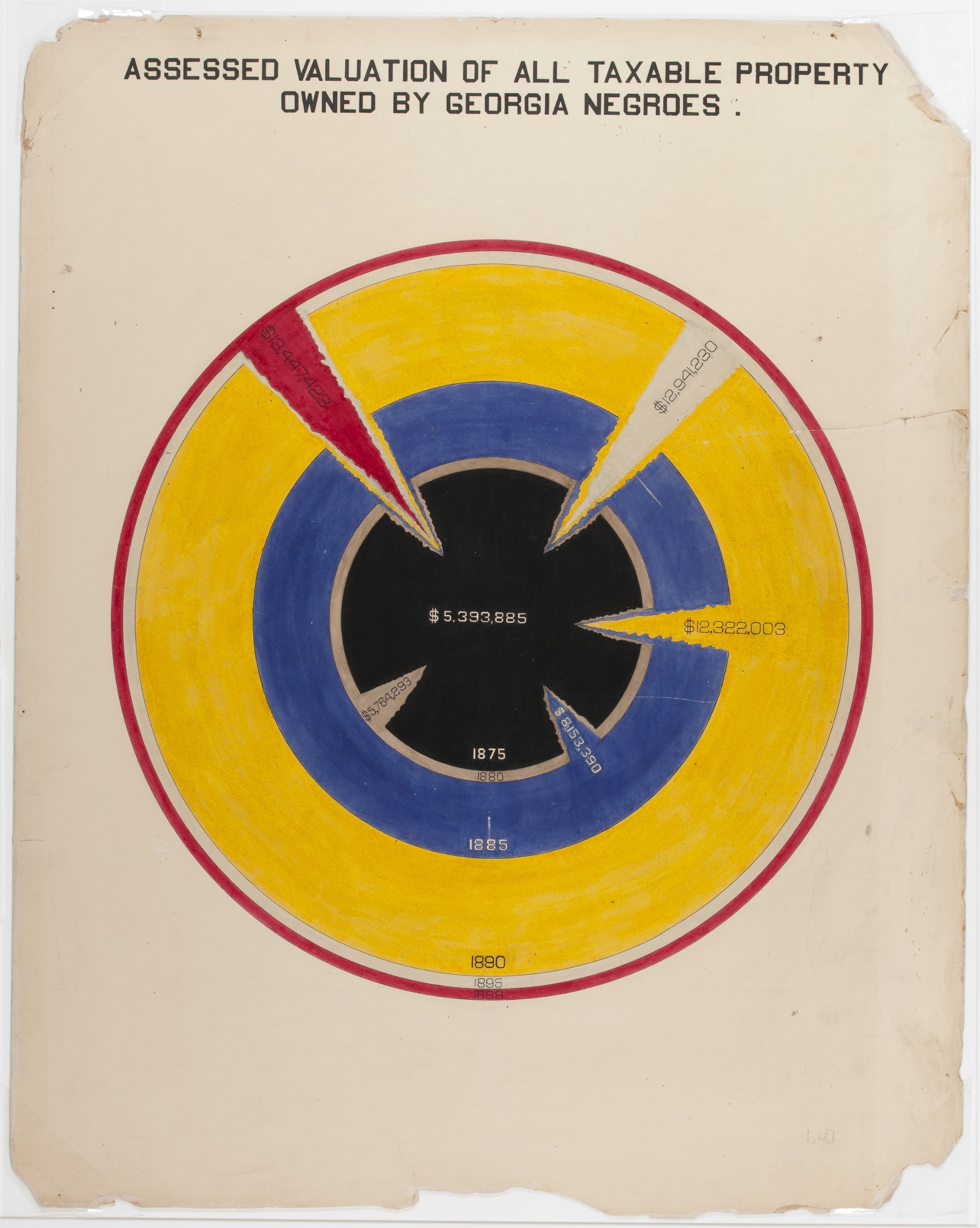
The House of Illustration’s exhibition presents visitors with the full set of graphs on display at the 1900 Paris Exposition. The 63 charts, in categories representing population, education, status, occupation, finance, ownership and maps, reveal the radical potential of infographics to tell the stories of lesser heard voices. One seemingly muted graph entitled “Valuation of Town and City Property Owned by Georgia Negroes” looks at first glance like the outline of a mountain range. Du Bois had chosen Georgia for particular focus because it had the largest African-American population. The graph’s faint lettering exposes the diminishing value of property owned by black Georgians as a result of “lynching” and what Du Bois coined “ku-kluxism”.
The original exhibition material is housed in the American Library of Congress. Despite this detachment, the House of Illustration does well to achieve something close to the act of leafing through the original charts; they are hung at eye level and on hinges, so visitors can mimic the motion of thumbing through pages of material. On the reproductions, fingerprints and stains remain visible, giving a sense of their materiality, reminding us that they were tactile objects.
In the main, Du Bois’ hand-drawn charts are visually exciting, using vibrant emerald, raspberry red, ultramarine blue and forest greens to illuminate their subject. The chart “Assessed Value of Household Kitchen Furniture Owned by Georgia Negroes” is not as insipid as its title suggests. Reminiscent of an ammonite, it spirals in pink, red, blue and yellow to illustrate how the black population were, against the odds set before them, growing in economic strength. Another on “Income and Expenditure of 150 Negro Families in Atlanta, GA. USA” features pasted photographs and gold leaf.
Together with Du Bois’ charts, the exhibition displays original artwork by Mona Chalabi, a Data Editor at the Guardian. Chalabi pays homage to Du Bois by adopting his bold colours and shapes to elucidate 21st-century data. In a Du Bois chart on “Occupation of Negroes and Whites in Georgia”, two wedges represent black and white Georgians, suggesting both are of equal value and capable of making a whole. Chalabi’s repurposing of the graph also tells us that now, as before, black and white Americans work in similar sectors. The story that the data fail to tell, though, is how that working life is experienced. While statistics are able to highlight trends and outliers, they are sometimes unable to shed light on the nuances of what is lived.
The original exhibition included 363 photographs. The pictures of well-to-do African Americans – both at rest and work – that accompany the graphs are a disquieting presence. On the one hand they appear as a discordant note in the tune of black debasement popular in Du Bois’ time. Yet it is hard not to feel that in playing the respectability card, Du Bois unwittingly limits the majority of black people within the confines he intended to escape. He believed “the negro race, like all races, is going to be saved by its exceptional men.” Another of his graphs reveals the dramatically increasing number of African-American students taking industrial courses in Georgia at the time. It attests to his pitch that African Americans were valuable not in and of themselves, but because they could add economic worth to the nation.
* * *
Another brightly coloured chart entitled “Conjugal Condition” uses the red, gold and green that would become the Ghanian flag. It shows that black Georgians, once forbidden under slavery to marry, were now asserting their right to do so. Du Bois places this data alongside that of the German population. As marriage was deemed an essential element of “civilised” society, Du Bois sought to show that two seemingly disparate groups were equivalent in dignity and rank.
Du Bois’ charts, with their striking clean lines and bold primary colours, are in keeping with inventive 19th-century data visualisation. Think of Florence Nightingale’s “coxcomb” diagrams on causes of war mortality in the army, or John Snow’s cholera map. They reveal that Du Bois, who would go on to write the seminal The Souls of Black Folk (1903) and become a co-founder of the National Association for the Advancement of Colored People, was aware of the power of infographics. They have been vividly rendered for a 21st-century audience, and present more than just a window into the past. We live in an age where a movement called Black Lives Matter remains sadly necessary in the US – and in this context, the precision and ingenuity of Du Bois’ work resonate powerfully today.


